July 31, 2026
Best Website Designs for Photography Portfolios (2026)
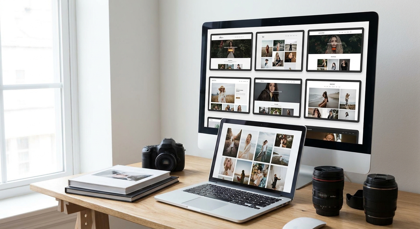
The best website designs for photography portfolios in 2026 put the image first and load the hero shot in under 2.5 seconds — anything slower loses the click before the work even loads.
- Full-bleed grid galleries win for portrait and wedding photographers in 2026 — Buy.
- Editorial scroll layouts convert best for photojournalists and event shooters — Buy.
- Video-forward parallax portfolios push mobile load past 2.5 seconds — Wait.
- Template-only builder sites cap gallery depth and image control — Skip.
- Best website designs for photography portfolios in 2026 pair a fast host with a real gallery structure, not just a pretty theme.
Why this matters
A photography portfolio is the only sales page most photographers get. Clients don't read an about-me paragraph before booking a wedding shoot — they scroll the gallery and decide in seconds.
A slow, cluttered, or over-templated site kills that decision before it happens. Photography portfolio website design in 2026 isn't about picking a pretty theme — it's about matching layout to shooting style, keeping load times under the Core Web Vitals thresholds, and giving clients an easy path to book. Get photography portfolio website design wrong and the images never get seen; get it right and the site does the selling.
How we ranked these designs
Each design style below is scored against three things that actually move bookings: load speed under real image weight, how well the layout matches a specific shooting niche (wedding, portrait, commercial, fine art), and how easily a visitor gets from gallery to contact form. Designs that look striking in a mockup but choke on 40+ full-resolution images get marked down — a portfolio that can't hold its own galleries isn't a portfolio, it's a demo reel. Verdicts reflect what performs for photography sites specifically in 2026, not general web design trends.
The ranked list
1. Full-bleed grid gallery — the safe pick
This is the format most award-winning photography sites default to: images run edge to edge with no border, captions appear on hover, and the grid resizes to 2-4 columns depending on screen width. It works because it puts zero design between the visitor and the photo.
One spec that matters: gallery load should stay under 2.5 seconds even with 30+ images if the site lazy-loads below the fold. Portrait and wedding photographers see the highest engagement here because clients are scanning for consistency across dozens of shots. Buy — this is the default for a reason in 2026.
2. Editorial scroll layout — the wildcard
Instead of a grid, images run in a vertical story with text breaks between sections — closer to a magazine spread than a gallery page. It's the strongest format for photojournalists and event shooters who need to show a narrative, not just a collection of good frames.
The tradeoff: it takes more image curation up front, since a weak sequence reads as a weak story. Buy for event and documentary photographers; skip it if the work is single-subject portraiture where sequence doesn't matter.
3. Minimalist single-column — the quiet flex
One image at a time, generous white space, no navigation clutter. This format signals confidence — it says the photographer doesn't need tricks to hold attention.
It underperforms on mobile scroll depth, though: visitors see fewer images per session than with a grid, and fine-art photographers with large catalogs can lose browsers who don't scroll far enough. Hold until the catalog is under 60 images total — past that, a grid does more work.
4. Dark mode moody portfolio — the niche pick
Black or near-black backgrounds make color and contrast pop, which is why fine-art and wedding photographers with cinematic editing styles lean on it. Text and navigation stay minimal so the dark background does the framing.
It's a mismatch for family, newborn, or lifestyle photographers where the brand needs to feel warm and approachable — dark mode reads somber in that context. Buy for fine-art and cinematic wedding work; Skip for family and lifestyle niches.
5. Integrated client gallery and booking hybrid — the working pick
This design bakes a private client gallery and a booking flow directly into the portfolio site, so a visitor can browse public work, then get routed to a password-protected proofing gallery once they're a client. It's the format that turns a portfolio into a working business tool instead of just a showcase.
Pair it with a real booking system for client galleries rather than a generic contact form — photographers lose bookings when scheduling requires three email exchanges. For final delivery, some studios route proofing through dedicated cloud gallery platforms instead of building that layer into the main site, which keeps the portfolio itself lighter and faster. Buy for any photographer taking more than 10 bookings a month.
6. Video-forward parallax portfolio — wait on this one
Parallax scroll effects and embedded video reels look impressive in a pitch deck, but they're the single biggest reason photography portfolios blow past the 2.5-second LCP threshold in 2026. Every added video autoplay and scroll-triggered animation adds render weight on mobile, where most first visits happen.
It can work for videographers whose product is motion, not stills — for a still photographer, it's overhead with no payoff. Wait until hosting and compression can guarantee sub-3-second load; otherwise it costs more bookings than it wins.
7. Template-only builder site — the trap
Drag-and-drop templates from generic site builders look fine at a glance but cap gallery depth, image resolution handling, and load-order control. The photographer ends up designing around the template's limits instead of the other way around.
These sites also tend to ship with bloated default code that hurts Core Web Vitals scores before a single photo is added. Skip — a photography business built on visual quality shouldn't run on the same shell as a hobby blog.
“If the hero image takes more than 2.5 seconds to load, the client has already scrolled away before the portfolio starts working.”
Comparison table
| Design style | Best niche | Load speed reality | Verdict |
|---|---|---|---|
| Full-bleed grid gallery | Portrait, wedding | Fast if lazy-loaded | Buy |
| Editorial scroll | Photojournalism, events | Moderate, depends on image count | Buy |
| Minimalist single-column | Fine art, small catalogs | Fast, low scroll depth | Hold |
| Dark mode moody | Cinematic wedding, fine art | Fast with compressed assets | Buy (niche) |
| Client gallery + booking hybrid | High-volume studios | Fast if kept separate from proofing | Buy |
| Video-forward parallax | Videographers | Slow on mobile | Wait |
| Template-only builder | Nobody serious | Slow, bloated by default | Skip |
Get a photography portfolio site built right
Flat monthly plan covers design, hosting, and maintenance.
Where to source the build
- Confirm the studio or developer shows gallery-heavy portfolio work already, not just brochure sites — image handling at scale is a different skill than a five-page business site.
- Ask what's included after launch. A site that isn't backed by a real website maintenance plan drifts out of date fast, and photography portfolios need frequent gallery updates.
- Check the hosting stack can hit the 2.5-second LCP target with full galleries loaded — ask for a live example, not a promise.
FAQ
What is the best website design for a photography portfolio in 2026?
A full-bleed grid gallery with lazy loading is the safest default in 2026, holding load times under 2.5 seconds even with 30 or more images. Editorial scroll layouts work better for photojournalists and event photographers who need to show a narrative sequence.
Is a dark mode portfolio better than a light background?
Dark mode works well for fine-art and cinematic wedding photography where moody color grading needs contrast to pop. It's a poor fit for family, newborn, or lifestyle photographers, where a warmer, lighter background matches the brand better.
How much does a custom photography portfolio website cost in 2026?
Costs vary by scope, host, and whether booking and client galleries are built in versus handled by a separate proofing tool. A flat monthly subscription model covering design, hosting, and maintenance avoids a large upfront build fee.
Should a photographer use a website builder template or a custom design?
Template-only builders cap gallery depth and image resolution handling, which hurts a visually driven business the most. Custom builds cost more upfront but hold up better once a catalog grows past a few dozen images.
Do photography portfolios need built-in booking systems?
Studios taking more than 10 bookings a month benefit from an integrated booking flow rather than a plain contact form. It cuts the back-and-forth email exchange that often costs a booking before it starts.
How fast should a photography portfolio load in 2026?
Google's Core Web Vitals set the bar at under 2.5 seconds for the largest content element and under 200 milliseconds for interaction response. Portfolios that miss this on mobile lose visitors before the gallery finishes loading.
Is a video-heavy parallax design good for a photography site?
It works for videographers whose product is motion, but for still photographers it usually adds load weight without adding bookings. Autoplay video and scroll animations are the most common reason photography portfolios fail the 2.5-second load target.
What's the biggest mistake in photography portfolio design?
Choosing a design for how it looks in a mockup instead of how it performs with 40 real, full-resolution images loaded. A gallery that can't hold the actual catalog isn't a working portfolio.
One last thing
Most photographers redesign their site around a new editing style or niche shift, but the layout rarely needs to change — the compression pipeline does. A grid gallery built in 2022 and still running uncompressed 4MB images in 2026 will fail the same load test a badly designed site would, even with a great layout underneath it.