July 27, 2026
Website Design for Wedding Planners: 2026 Buying Guide
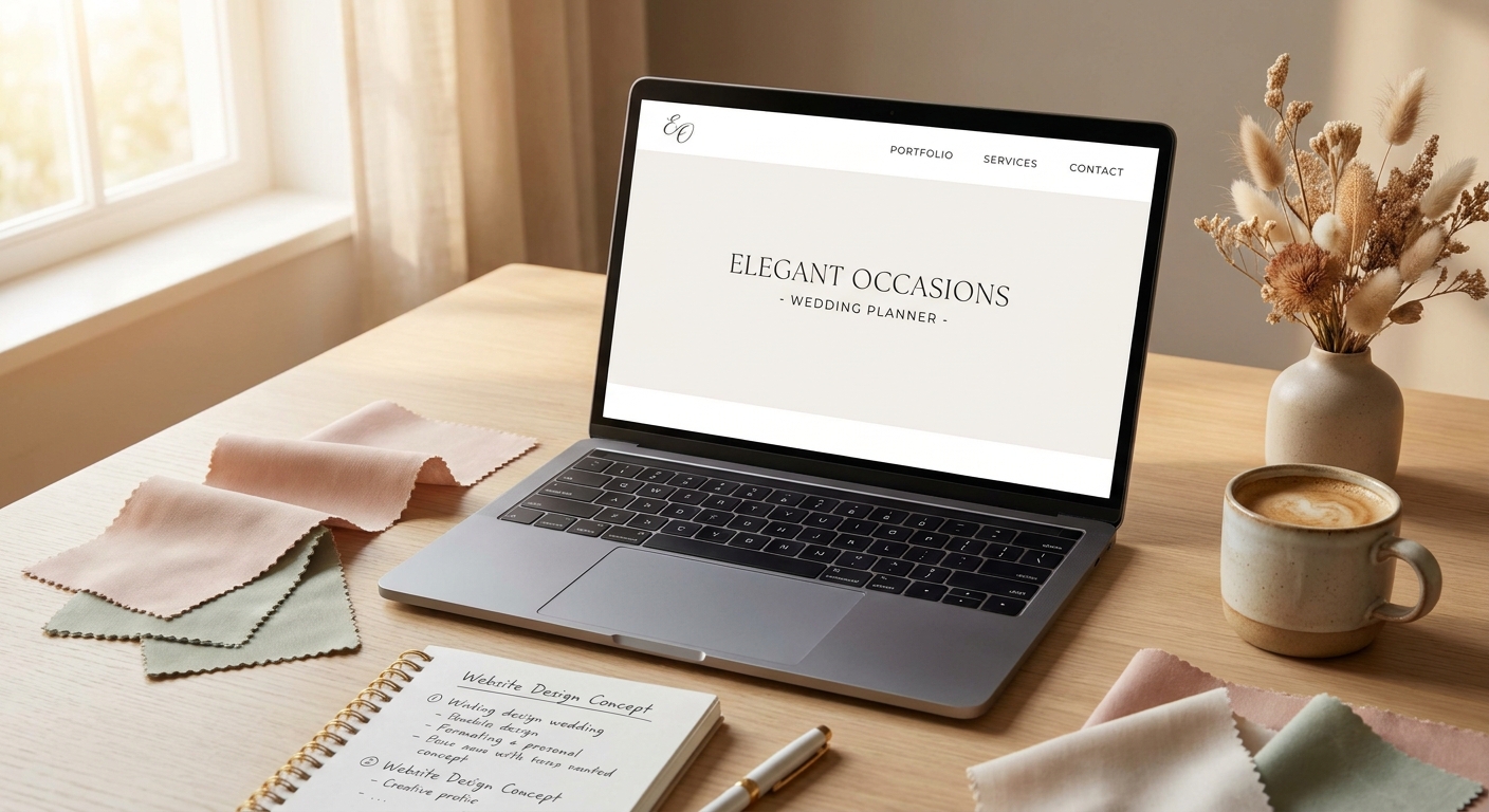
A wedding planner's website has one job: convince an engaged couple to book a call before they scroll to the next planner on their list. In 2026, most of that vetting happens on a phone screen in under a minute, which means website design for wedding planners has to work harder and faster than almost any other small-business site category.
- Website design for wedding planners in 2026 should lead with real wedding galleries, not stock photography — Buy.
- Booking forms that ask for date, budget, and guest count convert better than a plain contact box.
- Mobile pages should load under 2.5 seconds — Google's Core Web Vitals threshold — or couples bounce to a competitor.
- A flat monthly subscription site beats a one-time DIY builder for planners who update packages every season.
- Skip template sites with no local structure — they can't compete for searches like wedding planner in your city.
Why this matters
Referrals and Instagram get a wedding planner discovered. The website decides whether that discovery turns into a booked consultation.
Couples researching planners in 2026 typically check three or four sites back to back before picking up the phone. A slow gallery, a generic "Contact Us" form, or a site that looks identical to five other local planners costs the booking without the planner ever knowing a lead existed. Couples who don't hear back within roughly 24 hours of submitting an inquiry tend to move on to the next name — the site has to make that first response easy to trigger and easy to act on fast.
This is why event planner website design overlaps heavily with wedding-specific builds: both categories sell an experience before a service, and both live or die on how well the portfolio and booking flow work together.
Who this is for
This guide is for solo wedding planners running their business from a laptop, boutique planning studios juggling a full season of weddings, and day-of coordinators expanding into full-service planning who need a site that looks like the bigger business they're becoming. If bookings currently come entirely from word of mouth and the site is an afterthought, the criteria below apply directly.
What to look for in a website for wedding planners
Portfolio-first layout
Couples hire based on aesthetic fit before anything else, so the homepage needs real wedding photography above the fold, not a stock image of a bouquet. A gallery that opens into full-size, swipeable images of actual weddings the planner has run does more selling than any paragraph of copy.
Inquiry form built for wedding logistics
A generic "name, email, message" form forces the couple to type out details they'd rather select. Fields for wedding date, guest count, venue status, and rough budget range let the planner qualify leads before the first call and signal that the business runs on process, not chaos.
Mobile speed
Most wedding research happens on a phone, often while scrolling Pinterest or Instagram in the same session. A hero video or an unoptimized gallery that pushes load time past Google's 2.5-second Core Web Vitals benchmark loses couples before the page finishes rendering.
Local search structure
Searches like "wedding planner in [city]" or "[venue name] wedding coordinator" only surface planners whose sites are structured around a location and, ideally, venue relationships. A single generic "Services" page with no local signals gets outranked by planners who bothered to build that structure in.
Trust signals above the fold
Review counts, vendor partnerships, and press mentions belong near the top of the homepage, not buried on an About page three clicks deep. Couples are making a five-to-six-figure decision and want proof someone else trusted this planner first.
Easy content updates
Packages, availability, and seasonal promotions change more often on a wedding planner's site than on most small-business sites. A build that requires a developer for every text edit becomes a liability the second pricing or availability shifts mid-season.
Top approaches for wedding planner websites
The portfolio-led studio site — the safe pick. Built around a large, categorized gallery (by venue, by season, by style) with a short services page and a qualifying inquiry form. This mirrors the structure that works well for photographer portfolio sites, where the visual work has to carry the sales pitch. Load time under 2.5 seconds is non-negotiable here since the whole site is image-heavy. Buy for any planner whose bookings depend on aesthetic fit.
The booking-first funnel site — the wildcard. Leads with a short-form quiz or multi-step inquiry form before the gallery even loads, designed to capture contact info fast and route leads by budget tier. Works well for planners running paid ads or getting heavy referral volume who need to triage 15+ inquiries a month without losing track of any. Consider if lead volume already outpaces manual follow-up.
The multi-planner agency site. Built for studios with two or more planners, with individual planner bio pages, a shared portfolio, and a centralized booking form that routes by planner availability. This structure only pays off once a studio has more than one planner taking bookings — a solo operator adds unnecessary pages by copying this model too early. Consider for studios past the solo stage, Skip for anyone booking under their own name only.
The one-page starter site. A single scrolling page with a gallery section, a short bio, and a contact form — no separate pages for services or packages. Fast to launch and fine as a stopgap, but it caps how much local SEO structure the site can carry since there's nothing to build city or venue pages around. Consider as a launch step, not a long-term build.
The DIY template site with no gallery lightbox. Looks acceptable in a quick glance but forces couples to click through low-res thumbnails one at a time instead of swiping a full gallery. It reads as unfinished the moment a couple compares it to a competitor's smoother portfolio experience. Skip.
Get a wedding planner site built right
Custom-built site, hosting, and maintenance under one flat monthly plan.
What to avoid
- A hero video autoplay on mobile. It looks polished on a laptop and tanks load time on the phone where most couples are actually browsing.
- Pricing pages with no ranges at all. Total silence on cost sends budget-conscious couples straight to a competitor who at least gives a starting range.
- A contact form with no qualifying fields. "Send us a message" forces the planner to chase down date and budget details manually on every single lead.
Verdict comparison
| Approach | Portfolio depth | Booking flow | Best for | Verdict |
|---|---|---|---|---|
| Portfolio-led studio site | High | Simple qualifying form | Aesthetic-driven bookings | Buy |
| Booking-first funnel site | Medium | Multi-step quiz | High lead volume | Consider |
| Multi-planner agency site | High | Routed by planner | Studios with 2+ planners | Consider |
| One-page starter site | Low | Basic form | New solo planners | Consider |
| DIY template, no lightbox | Low | Generic contact box | No one | Skip |
A flat monthly subscription model, like the structure covered in website subscription plans for small businesses, fits the portfolio-led and multi-planner approaches best since both need regular updates as new weddings and testimonials come in each season.
FAQ
What's the best website design for wedding planners in 2026?
A portfolio-first layout with a fast-loading gallery of real weddings and a qualifying inquiry form performs best in 2026. Generic templates with stock photography convert far fewer inquiries into booked calls.
How much does a wedding planner website cost?
Cost ranges from free DIY builders to custom-built sites with ongoing design and hosting support. A flat monthly subscription spreads that cost as a recurring fee instead of one large upfront build bill.
Is a DIY builder good enough for a wedding planning business?
A DIY builder can work as a launch stopgap but usually lacks the local SEO structure and gallery performance that portfolio-driven bookings depend on. Most planners outgrow it once inquiry volume picks up.
Do wedding planners need a blog on their website?
A blog helps with local search visibility for terms like wedding planner in a specific city, but it's not the first priority. Gallery quality and booking flow matter more for converting the traffic that already arrives.
How many pages should a wedding planner's website have?
Most wedding planner sites need five to seven pages: home, portfolio, services or packages, about, testimonials, FAQ, and a contact or inquiry page. Fewer pages work for a one-page starter site, but growth usually requires expanding.
Should wedding planner websites show pricing?
Showing at least a starting range keeps budget-mismatched leads from filling up the inbox. Complete silence on cost pushes budget-conscious couples toward a competitor who gives some indication upfront.
How fast should a wedding planner's website load on mobile?
Aim for under 2.5 seconds, which is Google's Core Web Vitals benchmark for largest contentful paint. Image-heavy portfolio sites are the most likely to miss this without proper optimization.
Can one website serve a wedding planning agency with multiple planners?
Yes, a multi-planner agency site works once a studio has two or more planners taking bookings under one brand. It needs individual planner bio pages and a booking form that routes inquiries correctly, which adds unnecessary complexity for a solo operator.
One last thing
The detail that gets overlooked most often isn't the gallery or the form — it's what happens after a couple submits an inquiry. A site that sends an instant confirmation email, even a short one, keeps the couple from wondering whether the form actually worked. Planners who add that single automated step report fewer duplicate submissions and fewer "just checking if you got my message" follow-ups clogging the inbox during peak booking season.